


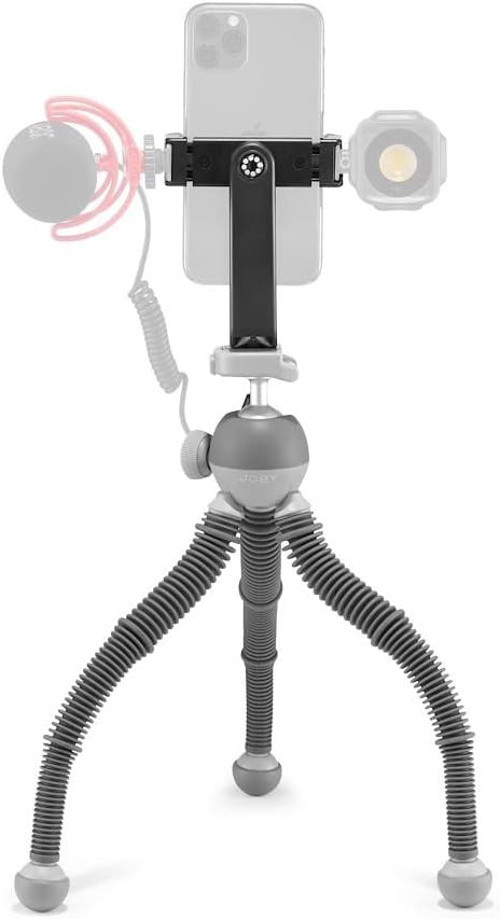


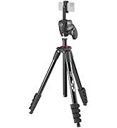
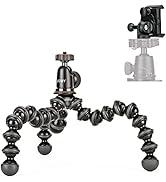
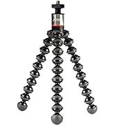
Joby Podzilla Büyük Kit, Griptight 360 Telefon Montajlı Esnek Tripod, Gorillapod Yaratıcılarından Te

Şimdi JOBY teklifleriyle alışveriş yapın!
-


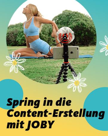
Joby olarak Connect & Create'e yaratıcılığın ifadesi olarak inanıyoruz. Wir sind immer für die lieben, was sie schaffen, die Grenzen überübereiten, die die ist, die es Cesaret zu cesur sein, die die mit ihren İçindekiler iz bırakmak isteyenler için her zaman buradayız. Ve elbette bu yolda eğlenmeyi sevenler. Eğer bu tür içerik oluşturucular iseniz, biz sizin yanınızdayız.
-
-
JOBY Deals hakkında daha fazlasını keşfedin!
-
JOBY Deals hakkında daha fazlasını keşfedin!
-
Neden idefix?

Siparişinizi teslim aldığınız tarihten itibaren 14 gün içinde iade edebilir, iade sürecinin tamamlanmasının ardındansa ödemenizi hızla geri alabilirsiniz.

Kullanıcı dostu ara yüzümüz tüm ihtiyaçlarınıza eksiksiz yanıt verebilmek için tasarlandı. Deneyiminizi uçtan uca kusursuz kılmak adına çağrı merkezimiz ve canlı destek hattımızla ihtiyaç duyduğunuz her anda yanınızdayız!

Siparişlerinizin bir an önce ulaşması için sabırsızlandığınızın farkındayız. Sunduğumuz farklı teslimat seçenekleri arasından size en uygununu belirlemeniz, siparişinizi olabildiğince çabuk veya dilediğiniz zaman aralığında sorunsuz bir biçimde teslim etmemiz için yeterli.